Let’s continue with our analysis of a Zero Hedge (ZH) post. (You can read the first two parts here and here.) Today’s sentence (with a chart!) is:
The chart below shows this quite clearly as VIX (At-the-money vol) ebbs away (red arrows) as the day-to-day vol of more ‘normal’ mark-to-market movements is culled thanks to the liquidity fueled effervescence, the rise in out of the money (or crisis/event risk) vol has risen dramatically (white arrows).
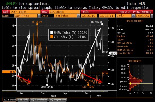
The Chart
Let’s begin by looking at the chart. First, let me crop out all the UI clutter that doesn’t matter:
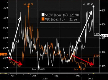
Now, notice that this chart is a bit of a cheat; the two plots aren’t really in the same space. The white plot is made against the X-axis (time) and the right Y-axis (SKEW index values). The orange plot is made against the X-axis (time) and the left Y-axis (VIX index values). The offsets and scales of the two Y-axes have been deliberately chosen to put the two plots on top of each other. Now, maybe there’s a real relationship, maybe there isn’t, but a fair bit of shoving was required to even get the plots onto the same screen.
That said, the arrows clearly illustrate what our intrepid author is banging on about: Twice, once in early March 2010, and once in late November 2010, the VIX index drops while the SKEW index rises. The March divergence ended after about 60 days when VIX rose sharply. The November divergence is … still there, 90 days later. (Later, we’ll see that the author believes that the March pattern will repeat. Eventually.)
Note that of the 12 months shown, VIX and SKEW only (generally) moved in the same direction for … 7 of them.
Causality (VIX)
The author writes that “the day-to-day vol of more ‘normal’ mark-to-market movements is culled thanks to the liquidity fueled effervescence”. I’m not sure what this means, and I’ll spend only a little time trying to puzzle it out, because it’s almost surely bunk.
Look at the form of what he’s saying: He’s retroactively explaining market movements in terms of stimuli. This is akin to saying (after the fact) that “the DOW fell 1% today on worries about the effects of curtailed Russian natural gas supplies on European demand”; in other words, it’s storytelling. In this particular case, the author is “explaining” the drop in VIX in terms of a single cause (the effects of “liquidity fueled effervescence” on “mark-to-market movements”). Do you really think it’s that simple?
As for what he actually means: Well, I think that “effervescence” is akin to Greenspan’s “irrational exuberance“, and that “liquidity fueled” refers to the effects of the low federal funds rate and “quantitative easing” policies which the Fed has recently pursued. I think the idea is that market participants are assuming that the S&P 500 won’t change unpredictably because easily borrowed money will ensure steady returns. I’m not sure how that’s supposed to work, or what “mark-to-market” has to do with it. Maybe he means that, in the event of a market drop, market participants will be able to cover their margin calls with borrowed money, instead of having to sell assets into a falling market, thereby aborting a vicious cycle, and that the expectation of this scenario is reflected in the implied volatility of the options that go into VIX. Or maybe not.
Honestly, your guess is as good as mine. It’s basically all fairy-stories, unless he wants to cough up some long-term statistical correlations between Fed policy and expected volatility and/or VIX.
Causality (SKEW)
The author writes that “the rise in out of the money (or crisis/event risk) vol has risen dramatically”. Yes, that’s right. “[T]he rise … has risen dramatically.” Oh boy.
As far as I can tell, the supplied chart doesn’t really require this interpretation. The chart shows SKEW rising for the intervals the author discusses, but SKEW is not synonymous with “out of the money vol[atility]”. SKEW is a measure of the shape of the implied volatility vs. strike price curve for out of the money and at the money options. The shape of the curve can be changed in several ways.
For instance, if the implied volatility of far out of the money puts increases while that of other options remains the same, then SKEW will increase. (This is the scenario the author credits for the rise in SKEW.) But SKEW will also increase if the implied volatility of out of the money calls and at the money options decreases, while the implied volatility of out of the money puts stays the same. You can’t tell just by looking at SKEW which part of the curve has moved. (It might also be worth mentioning that a simple across the board rise in volatility for these options wouldn’t change the SKEW, as it wouldn’t change the shape of the curve.)
The author’s suggestion that the increase in SKEW is due to a disproportionate increase in implied volatility for (very) out of the money puts might be true, but is not supported by any supplied data.
Summary
At this point, the author has presented a chart contrasting the overall market’s expectations of near-term volatility as measured by the VIX and SKEW indices. He points out that these metrics have recently diverged, and attributes this divergence to the failure of the less-sophisticated VIX index to accurately capture complex market sentiments occasioned by the Fed’s expansion of the money supply, i.e. easy credit extended to banks.

Pingback: Quantitative Easing | Things that were not immediately obvious to me